Staying relevant is a must for all web designers. New styles are brought in and new technologies can implement a new level of richness to your webpage. At HayWire we’re always trying new things and here are some of the design concepts that we are implementing to stay ahead of the curve.
Bite Sized Copy
No one wants to read an essay when they browse your homepage. The same reason that no one wants a shop keep to drone on and on about the fine history of their store if they are just looking for a T shirt. For design on the homepage, you should keep your content to bite sized pieces. Users want to scan information and make a decision where to go next based on their needs. If they want to read the entire history of the company, cool. Let them do that on the about page. The homepage should offer information on all key aspects of the company in text pieces roughly the size of tweets. This is because people’s attention span is short, and users get overwhelmed by a barrage of text.
Large Fonts and Rich Content Attract Interaction
Dont be afraid to jack up the size of your headline text. It should stand out above all else and help direct the user. When paired in tandem with beautiful imagery, and bite sized amounts of copy (see above) it creates a much more interest.
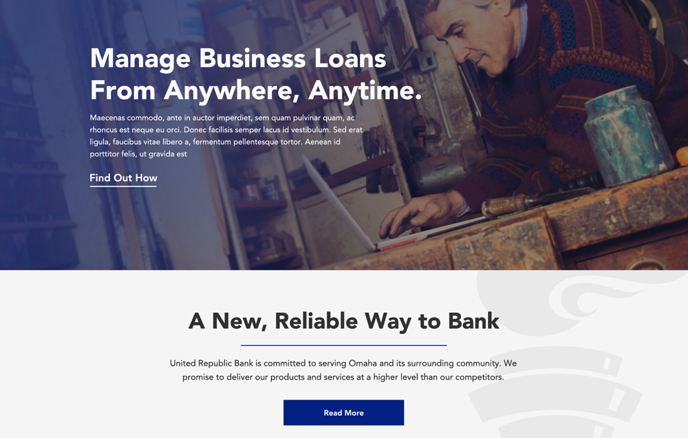
Large fonts and smaller amounts of copy attract user attention
2016 Will See the End of Useless “Fluff” Technology
I read an excellent article about what is known as a “mullet website”, which is probably my favourite term I have heard so far in the business. Heres what a mullet website is: Its a website so bogged down with needless tech (parallax I’m looking at you) that it seems captured in time, for the fleeting moment that the technology was trendy. Someone once said trend is only a few months away from becoming passé, and even though I forget who it was, that always stuck with me. Mullet websites are designers getting excited over new technology, selling it on their clients, and then creating over-designed websites that will cause both the designer and company owner to cringe when they look back at them a few years later. Just like that mullet you had, that got you so many chicks in the early 90s.
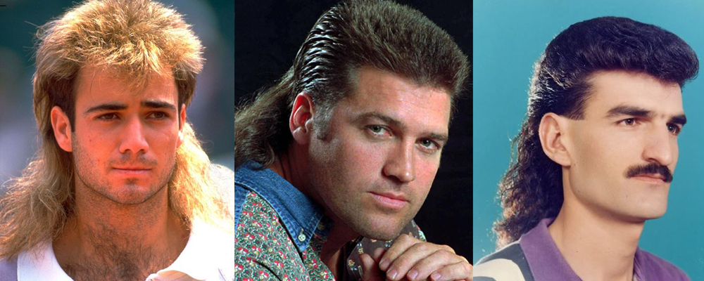
And you thought this look was timeless
New web tech is constantly being pushed out and people are trying to get in with the latest trend. What we focus on is designing timeless websites that while they might age, will do so as gracefully as possible. It’s like comparing Led Zeppelin to Vanilla Ice. One is still awesome after 40 years, and the other… well you get it.


