Here is the second part of my design predictions for the upcoming year.
Less Corporate Photography
We’ve all seen it before. Boring imagery selection. A website for a corporate business that has the stereotypical multiracial and multi-gendered team of people in suits all shaking hands as their main hero image. Generalization like this gives off a ‘watered-down’ image of your company and completely removes any personal component from your image.

Alright everyone….business on 3!
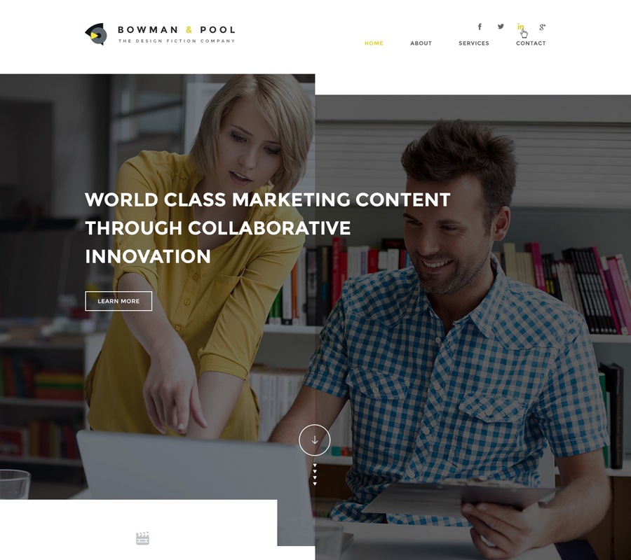
Fortunately, the new wave of ‘stock’ photography focuses on providing more candid style photos, and tries to be far less ‘stock’ than its predecessor. The companies that really go the extra mile and get a photographer in their office give off the best impression to users. In fact, we work with several local photographers that will come on-location to take photos for your website.
Personally, when I visit a site and I cant find a picture of an ACTUAL person that works there, or I am bombarded with overly corporate stock photography, I bail. To me it seems like a smoke screen for an obviously unprofessional environment or makes me wonder if the business even exists. First impressions are hard to change.
Asymmetrical Layout
Now that I have ranted about image selection, let’s dive into what I assume will be big this year as well. Asymmetrical layout. Asymmetrical layout is just a deviation from the standard grid based layout. I believe that while web design is killing print, it will eventually emulate it.
Think about it – if you open a magazine and the every article had an image at the top and 2 columns of neat text, you would lose interest.
So as web becomes the norm, companies should seek to make their sites stand out from so many tight, boring grid layouts. Just look at what the good folks at Elegant Seagulls have done with this surfing website, as well as this awesome layout from Teodora.


These striking designs give the user a sense of interaction with something unique. This goes a long way when the users are considering making a conversion on your web page. As long as your symmetrical (or lack thereof) decisions don’t hinder usability, it shows visitors that you are invested in new ideas and looking to the future. It has the complete opposite effect from the one boring stock photography presents.
In Summary
These are just 2 things to consider when updating your website for 2016. For a few years, websites have become essential for all business and just about everyone has gotten on board. What we have now is the beginning of a grand stagnation – when everyone who got their first website a few years ago is starting to realize that websites need to be updated to stay fresh. Those who stay on the cutting edge will find increased user connection and more conversions than those who let their design sit and stagnate.


