Not sure how to build the best converting landing page? Check out how Lyft does it, here. See why their page layout is a powerful model, and what each part does independently. You’ll want to take notes and possibly try a layout like this for yourself!
Hey @Lyft, your brilliant #landingpage was praised by our design lead, @KyleJCDesign — check it out! Click To TweetView the full landing page, here!
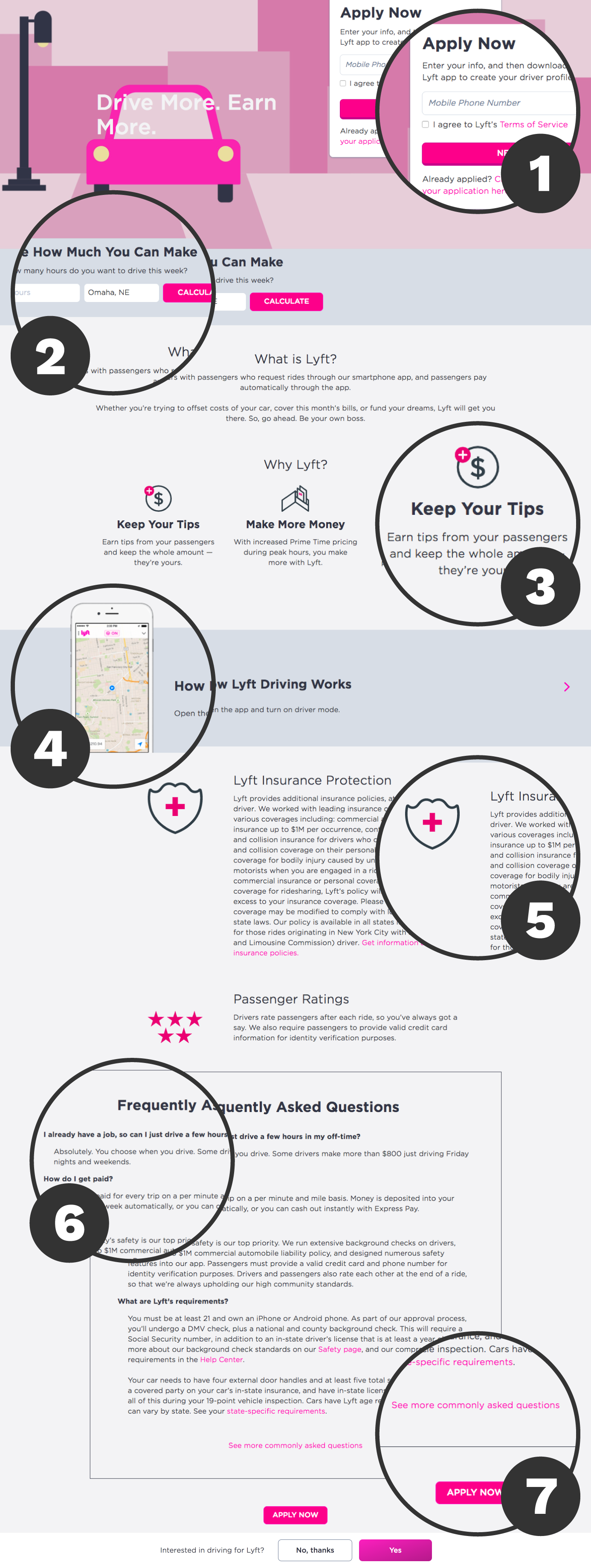
Success #1: Having a Form in the Header Area
If you’re making landing pages, the number one thing to have is a form. It’s all about the placement, though. Lyft’s decision to put it in the header area makes it appear “above the fold” (otherwise known as what’s shown on a webpage before a user scrolls) and gives the user immediate access to sign up. The further down on the page the form is located, the greater the risk the user might not fill it out and instead leave. So if you want leads, it’s a good idea to bring the form to the user’s attention immediately.
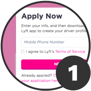
Success #2: Giving Incentive with a Wage Calculator
One of the things that makes web pages amazing is UX (user experience) design. By putting a a wage calculator right under the header, still above the fold, it gives users instant incentive to apply by knowing what they would earn. Since wages are typically different and vary by city and state, Lyft went even further to give users the ability to get customized wages tailored to their own town. To top it all off, after a user types in their hours and city to get an instant wage calculation, the button that once said calculate turns into an “Apply Now” button. This genius final touch allows Lyft to get more leads by giving users who were incentivized to click to apply.
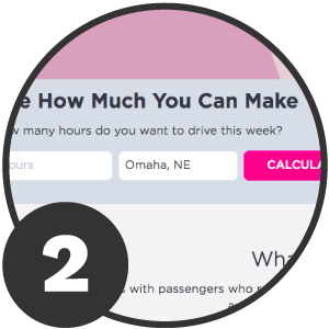
Success #3: Listing 3 Brief Reasons Why with Icons
It’s best practice to keep copy to a minimum on landing pages. Lyft follows this best practice by providing 3 brief reasons why to apply with accompanying icons and a short sentence for each. This simple row of icons and short text not only eliminates whitespace and helps users to avoid becoming overwhelmed, it gives an added incentive to apply and entices them to stay on the page and read on. To allow more whitespace, Lyft decided to put no body text under the subheader “Why Lyft” and let the icons speak, which is a great decision.
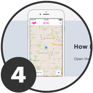
Success #4: Educating Users on How to Use the App Before They Apply
Now that the user is probably incentivized enough to want to apply, they might be wondering how they would go about performing the job. Lyft immediately addresses this question with a “How” section featuring simple on-the-job instructions using their app. Instead of listing boring step-by-step instructions, they capitalize on good design by placing a crisp phone mockup with actual app screenshots inside the form of a website scrollbar that changes with the accompanying text next to it as you scroll through the instructions. If that wasn’t amazing enough, the phone mockup was designed to peek up a little bit at the top and creep into the section above it which helps users stay on the page and scroll down to see what it is.
Why is @Lyft’s #landingpage brilliant in both #UI and #recruitment? Read why in @KyleJCDesign’s article: Click To Tweet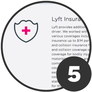
Success #5: Offering Peace of Mind with 2 Important Benefits
After becoming trained, the user can now see the benefits Lyft offers as a driver. By listing 2 important benefits such as insurance and passenger ratings, it lets users have peace of mind knowing they will be safe. The use of icons are a nice touch that helps bring a “designed” feeling to the benefits text which gives it more appeal. What makes this section a comfort to read is the larger padding on the left and right sides of the text and icon which makes the paragraph appear “thinner” and easier to digest.
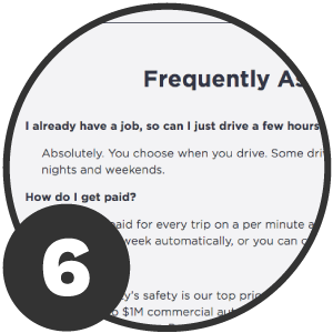
Success #6: Answering any Questions that Might Deter Potential Candidates
To cover any other last-minute questions that would deter users from not applying is providing a FAQ section. Lyft answers some common questions and gives brief guidelines into who can apply, how payment occurs, if it’s safe and how it can coexist with another job. This section was a clever decision that eliminates the user from having to call Lyft or navigate off this page and to their website to find the answers they need — which in turn could stop a candidate from applying. Even if all of the questions weren’t answered here, a link to more questions is provided just in case.
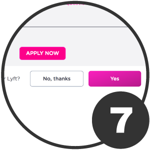
Success #7: Having a Sticky CTA Bar & Repeated Apply Now Button
For the cherry on top, Lyft swiftly added a “sticky” call-to-action bar that remains at the bottom of the page as a user scrolls. This helps get users to apply at any time they feel ready to while viewing the page. That’s brilliant. If the user decides to ignore this sticky CTA bar and makes it to the bottom of the page, an “Apply Now” button is repeated for one last effort to get users to apply. Now that’s fine marketing, people.
Overall Rating: A-
Overall, the great UX, design, enticing copy and layout makes this landing page an A-. If it were to be shortened up a bit by making the benefits and FAQ’s much smaller vertically, the page would be a solid A+. While it’s important to have strong “above the fold” content, it’s crucial that everything on a landing page stays brief and to the point. The shorter the page, the stronger and more successful it can be in my opinion, since it eliminates the need to scroll. Though Lyft’s page is longer than usual for a typical landing page, they do make sure to provide extensive incentives and answers to the “What,” “Why,” and “How” questions a potential candidate might have in order to apply — all with an alluring look.


