Want to see the inspiration behind the website design we created for the local Omaha company, Retro Shirtz? In this article you’ll get an in-depth look into my inspiration and method for bringing it to life. This is one of my favorite websites we’ve ever built, so you don’t want to miss out! View the site and read the story below.
Check out the live Retro Shirtz website, here!

What They Wanted
Retro Shirtz is a local t-shirt retail company in Omaha, Nebraska that specializes in printing “tens-of-thousands” of unique and catchy shirt designs for customers to purchase each year. From 2012 to now, they’ve grown into “one of Omaha’s t-shirt printing leaders,” and wanted a cutting-edge eCommerce website to provide these designs to customers across the United States. They came to us with a plan, so we took time to discuss their vision. Here’s what they wanted.
- A site with primary colors of black and white, with accents of red and one cool color
- Iconography that’s housed in circles
- Rounded rectangle style buttons
- A mega menu-style navigation drop down, that features both images and links
- A bold capitalized font for headers
- Showing shirt color options in search results under each shirt design
What We Created
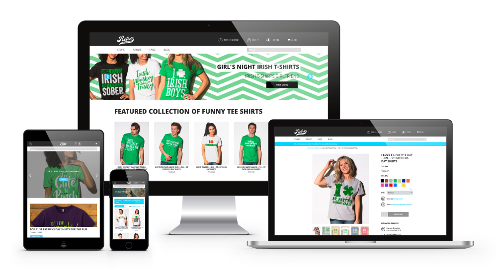
After an amazing intake call, we were able to execute the site they were looking for. To integrate the two accent colors into the mainly black and white site, we used a hierarchy system. Red is less dominant and used for text highlighting and buttons, while blue is more dominant and used for links, the navigation, mega menu, banners, icons, filtering and other buttons outside of the main page. For the font choices, we chose a contemporary bold sans-serif Google Font named Khula for headlines and paired it with a lighter body text Google Font named Assistant. These fonts pair well together because of their “new” and “fresh” feeling, which appeals to their younger target audience. For the menu, we custom-built a 4-column mega menu which fuses text, icons and imagery into a seamless and visually aesthetic menu. For filtering, we designed it with user experience (UX) in mind. This features a search box for manual searches, a safe search option, trending category links, subcategories with checkboxes for refined searching and a sorting feature. Finally, we capped the site with an interactive blog featuring a scrolling header, articles that populate underneath by date and a sidebar that displays the option to subscribe, recent post links and the current featured shirt.
@RedBranch can take your #website vision and bring it to life. See for yourself: Click To Tweet
What Makes it Stand Out from the Competition
After nailing the design and branding of the site, we wanted to make sure the site was both unique and more appealing than their competitors. This would ensure that users on the Retro Shirtz site would be more inclined to stay. We executed this by providing impressive features and beautiful page designs. Discover these key highlights and page designs below!
- An Interactive Footer. This footer features an interactive map of their location, clickable contact and social information, account links and legal information. Other competitors like Zazzle and Redbubble have small footers that are mainly text-based and overpopulated with clickable links.
- The Mega Menu. When you hover over the navigation menu and see the mega menu drop down, you’ll notice it’s much more appealing than Zazzle and Redbubble. Retro Shirtz features photos, links and icons in a much more designed layout than the outdated and stale text-heavy mega menu on Zazzle.
- A UX-Based Filtering System & Shirt Colors. When you go to the Store page to shop, you’ll notice how easy it is to filter your search results. What makes it better than the competition is the Safe Filter option, and the ability to see what colors are available in each shirt without having to click on them to find out. Compared to Zazzle and Redbubble, who have over-complicated filtering systems, the filtering system for Retro Shirtz is much more user-friendly.
- Beautiful Individual Product Pages. The individual t-shirt pages are beautifully designed, making it both easy to navigate and more appealing to stay on the page. Though Zazzle and Redbubble have similar individual product pages, what makes Retro Shirtz better is the larger text and icons for better readability, a more organized product information section, a less-congested related content area and a condensed reviews section. The key feature that sets Retro Shirtz apart from their competitors is additional color-scheme options. Rather than one background color and one text color, Retro Shirtz offers different background and different text color schemes for some shirts.
- A More Organized Blog. What makes the Retro Shirtz blog shine is the layout. Upon arrival, users can see the full scope of what the blog entails. Highlighted items such as subscribing, recent posts and the featured shirt are displayed on the sidebar while blog posts populate by date under a scrolling header image showing recent posts. Overall, the Retro Shirtz blog was designed to help the user navigate, while the Redbubble focuses too heavily on design and less on layout, making it hard for the user to navigate and Zazzle focuses too heavily on text, making the blog unappealing and overwhelming.
This site was one of my favorites I’ve designed with the web team, as an incredible amount of thought, planning and collaboration went into bringing it to life. From the initial call, to edits and execution, it was a smooth process. Kudos on the site launch Retro Shirtz, we’re happy you love it as much as we do! If you loved reading the story and have a site you need created for your business, let us help!


