Our design team specializes in customized logo consulting and creation. In this logo vault edition, see how we handcrafted a logo for the recruiting extraordinaire Paul DeBettignies’, Minnesota Headhunter! You’ll get an in-depth look at our process, our workflow and our passion to deliver the best quality logos to our clients.
 See how our team translated this @mnheadhunter’s goals and mission into a strategic logo! #GraphicDesign Click To Tweet
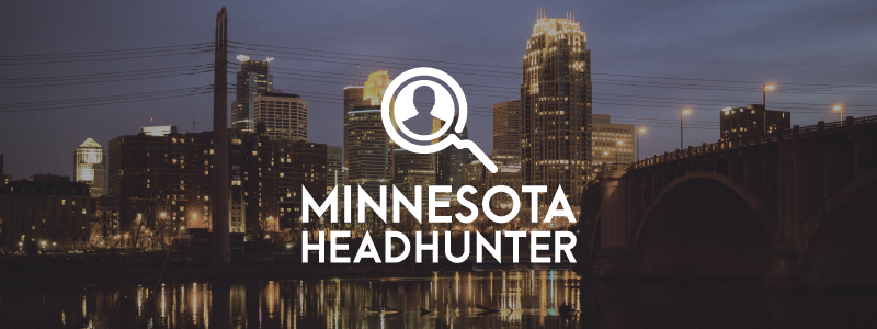
Check out our logo live on the Minnesota Headhunter website, here!
BONUS: We created his Midwest Recruiting Bootcamp logo, too!
What They Wanted
Paul DeBettignies came to us with a plan. As a leading headhunter in the Minneapolis area, he was in need of a logo for his career and wanted it to be perfect. After speaking with us, we were able to gather all the necessary information to start designing his logo. The creative room and permission he gave us is what made this design unique from all others we’ve created before.
Are you a one-person show or just starting your new #company? We know how to get on your level! See how we created an unique #logo for @mnheadhunter! Click To Tweet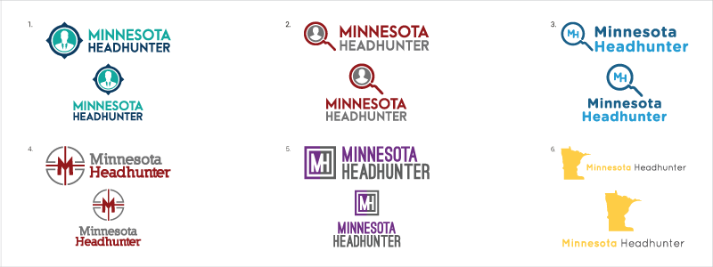
What We Created
Since we had a lot of creative room, we were able to create 6 fresh logos for Paul. Above is our first draft logo board. As always, we used this as a baseline for our 3-round process. We made sure to try a few different things relating to Minnesota and headhunting. For example, we integrated candidates, targets, magnifying glasses and an emphasis on the letters “M” and “H”. We even played up the natural face-like shape that appears on the right border of the actual state of Minnesota (seen in logo #6). Since there was no color preference, we tried a variety of bold and strong colors to symbolize his work ethic. We mainly used sans serif fonts, but tried 1 slab serif for the sake of providing a full view of his options. This process went incredibly smooth, and Paul was able to choose the logo you see today.
Check out this healthcare recruiting firm worked with us to create the perfect logo design!
The Decision
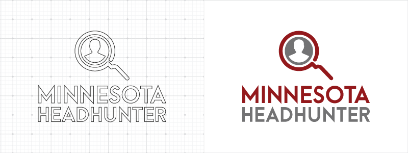
Paul chose logo #2 from the board above. This logo was a great choice because of its ability to work as a horizontal or vertical logo better than any others on the board. It also lets the viewer know what he does within seconds of viewing the logomark (a candidate inside a magnifying glass). It all signifies that he specializes in finding the perfect candidate. What’s more is that the sans serif font is a contemporary style that will prove timeless in the long run. We couldn’t be happier with his decision, and were thrilled we were able to deliver the perfect logo to represent his reputation.
This logo was one of the smoothest processes yet. From collecting notes to using the creative room we were given, we delivered a timeless logo that represents Paul’s career to the fullest. Enjoyed reading this story? Check out more of our graphic design articles or look at our completed project portfolio.


